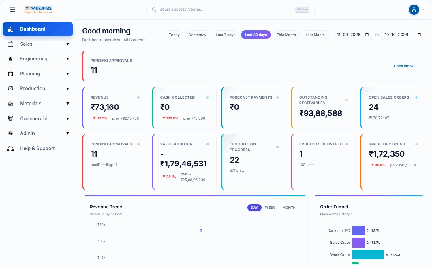





Why interfaces decide outcomes
Most software fails quietly. Nobody files a bug; people simply stop using it. In the products we have rebuilt, the gap between a feature that exists and a feature that gets used is almost always an interface problem: unclear hierarchy, too many decisions on one screen, feedback that arrives too late.
We treat UI/UX as an engineering discipline with measurable outputs. Every design decision has to answer a question we can test: does this reduce the steps to complete the task, does it lower the error rate, does it make the next action obvious?
Research before pixels
We start every engagement with structured interviews and shadowing sessions. For an operations dashboard that means sitting next to the supervisor at 7 am when the shift changes, not reading a feature list. We map the real workflow, mark where people improvise with spreadsheets or WhatsApp, and rank the friction by how often it happens and how much it costs.
The output is a journey map and a short list of jobs the product must do well. It is deliberately short. A product that does five things flawlessly outperforms one that does twenty things adequately.
Design systems engineers can consume
We build a token-based design system in Figma from the first sprint: colour, type, spacing, radius and elevation live as variables that export straight into code. Components ship with their states (hover, focus, loading, error, empty) so engineers never guess. The same system drives Storybook, which becomes the contract between design and development.
A design system is not a style guide. It is a shared vocabulary that makes the hundredth screen as consistent as the first.
Because the system is the source of truth, redesigns later cost hours rather than weeks: change a token, and every screen follows.
Psychology we actually use
Progressive disclosure keeps the first screen calm and reveals detail on demand. Fitts’s law tells us where primary actions should sit and how large they must be on a touch device used with gloves. Hick’s law argues for fewer, better choices per step. We apply these deliberately and measure the result rather than decorating a screen with them.
Micro-interactions matter more than animation for its own sake: a save button that confirms within 100 ms, an inline validation that explains how to fix the field, a skeleton that tells you the data is coming. Motion is used to explain state change, never to delay it.
Measuring what we shipped
Before launch we run moderated usability tests on the prototype with the people who will use the product, and we define the metrics we care about: task completion rate, time on task, error rate, adoption by role. After launch we instrument those same metrics and review them with the client in the first month. Design is finished when the numbers move, not when the screens look good.
- Research with real users before any screen is drawn.
- Tokens and components in Figma map one-to-one to code and Storybook.
- Every pattern must reduce steps, errors or time on task.
- Success is measured after launch against agreed metrics.
Keep reading
More from the team.

Cloud technologies at Neoteric
How we design and run cloud-native systems that are secure, scalable and optimised for cost and performance on AWS, Azure and GCP.

Software development at Neoteric
Robust, scalable, future-ready systems tailored to business needs, built on modern architecture, rigorous testing and signed-off milestones.

Web development at Neoteric
High-performance, SEO-friendly websites and progressive web apps engineered for scale, security and modern user experiences.

Want these in your inbox?
One email a month, written by engineers. Ask on the contact page and we will add you.